After all this effort, we finally made it to the best part. In this tutorial we will visually explore the network using Gephi, mostly because it allows for a nice and easy interaction with the network (i.e. through the mouse). However, the same process can be carried in many different ways.
Remember here that the analysis of the attitude system will roughly follow two steps:
- Visual (qualitative) exploration
- Numeric (quantitative) analysis
Another important point is that when we formalized ResIN we said that the output is a spatial network and that we can eventually visualize it. Meaning that the spatial nature of the network is not bounded to the visualization. However, Gephi (and possible other software) does not accept spatial networks as input, but only standard networks. At the same time Gephi offers force-directed algorithms for visualization. Therefore, in this part, we will directly use the visualization algorithm to display the network. However, if you need a precise localization of the items in the latent space, you can use the spring_layout function from networkx in Python.
5.1 Visualization
Before opening the file in Gephi, we need to save it in a way that is readable by the software:
filename = 'ANES_final'
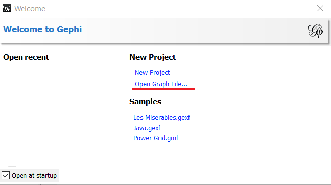
nx.write_gexf(G,filename+'.gexf')You can now open Gephi, click on “Open Graph file” and select the file we just saved.
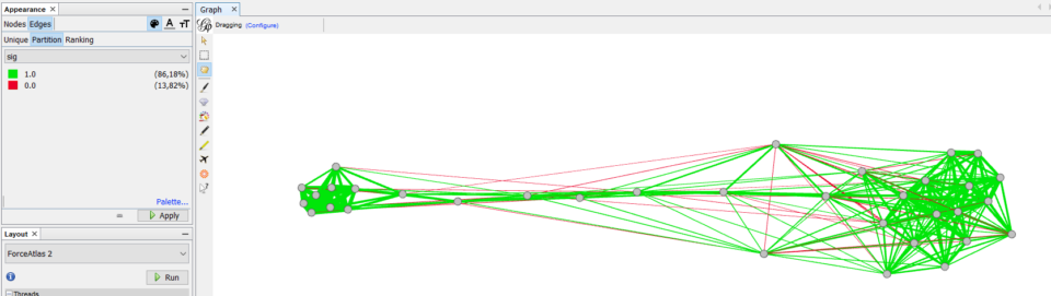
However, instead of finding a nice, ordered network, you will find something ugly and very confusing as the one below:
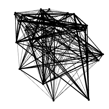
This happens because at the moment nodes are placed randomly. Therefore, we do not have the nice properties that attitudes which are often selected together also appear close to each other (or equivalently, attitudes with similar position in the latent space should also appear close to each other).
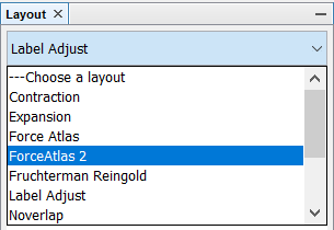
To perform this step, we need to use a force-directed algorithm that will place every node at the right place. Notice that for this step even Gephi offers you two options: Force Atlas and Force Atlas 2 (from the “Layout” panel). Which one should you choose? And will it make a difference?
From the previous analysis, the choice of the algorithm will not affect much the qualitative results (i.e. the overall patterns) when used with ResIN networks. Since we are visually exploring the patterns in the attitude system we will not worry too much about this choice, and we will proceed with Force Atlas 2. However, if you are looking for a precise quantitative connection with the latent space, you should use the spring_layout function from networkx in Python. Indeed at the moment, this is the only algorithm which has been quantitatively compared with Item Response Theory.
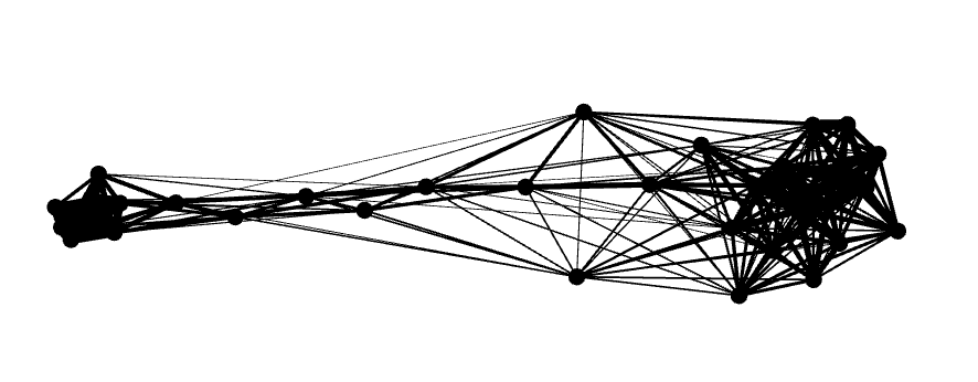
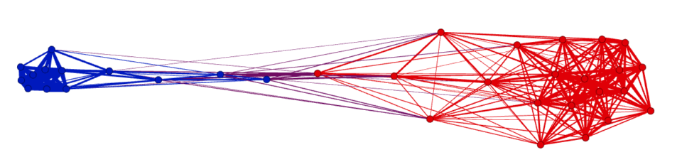
The result from Force Atlas 2 will look something like this:
If it is rotated, you can just “grab” some nodes and rotate it to your favourite direction. Also, to have a little better contrast you can also colour everything in grey (so the contour of the nodes will be clearer) using the appearance panel (which should be on your top left, see below).
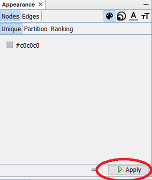
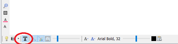
Furthermore, by clicking the dark T at the bottom (yes, there is also a white one…) you will turn on the labels.
So, now your network should look something like this:
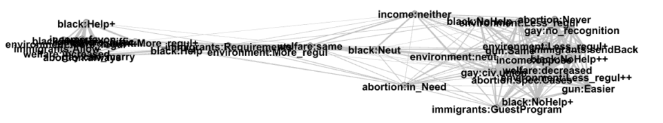
As you can see, this visualization has the disadvantage that, when you have a tight cluster, produces overlapping text which is unreadable (this is also the reason why we specified before that it is better to use short names for the attitudes). You can solve this problem in two ways: either decreasing the size of the text (from the horizontal bar at the bottom of the window) or by using the “label adjust” visualization. This visualization will move all the node further apart until their labels are not overlapping anymore. Notice, however, that this visualization will destroy the compactness of some clusters.
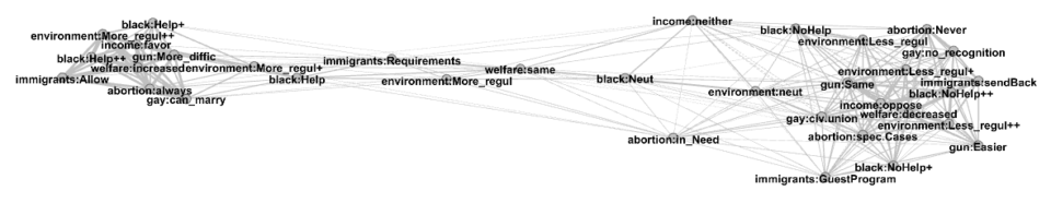
So, what should you choose? The main idea is to either find a compromise, or to keep moving between the two. If you are focusing on the compactness and position of the nodes, you will rely more on the Force Atlas visualization. Instead, if you are more interested in what the nodes are and how they are connected, you would use the label adjusted visualization.
5.2 Manual exploration and significance
One of the simplest way to explore the network consists in manually checking the connection between the nodes. In practice, this means that you can zoom back and forth to areas of the network that you may find interesting to see which nodes belong there and what they are connected to. However, this rises a question we asked some pages ago: how do we know that the connection between two nodes is significant?
Since we previously calculated the p value and the significance of each edge, we can include this information in the visualization. For doing so in Gephi, we need to go to the Appearance panel, select the Edges and and Partition (meaning that we will color them depending on some groups). Here as attribute select “sig” (i.e. the significance level) and make sure to select the right colors, such as green for 1 (i.e. for significant edges) and red for 0. You will have something like this:
Now, let’s say we are interested in “environment:Less_regul++”. We can then zoom on it and hover it to observe all the other nodes that are positively linked to it.
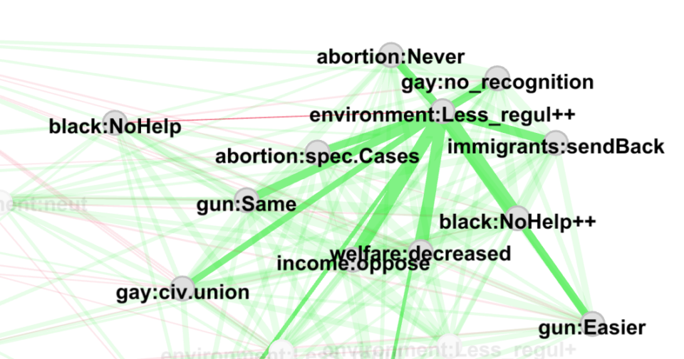
We can see that most of the links are strong and significative, while the connection with “black:NoHelp” is non significant. We may, however, want to know the correlation value and the p-value of a specific link. For doing this we could either go to the “Data Laboratory” panel of Gephi and select “Edges.” Or in python we could write
node1 = "environment:Less_regul++"
node2 = "black:NoHelp"
G.get_edge_data(node1,node2)
For these specific nodes we will obtain the following dictionary
{'weight': 0.004292419135647908, 'p': 0.7249416154833359, 'sig': 0.0}As expected, the correlation coefficient is very small (0.004) while the p-value is extremely big (0.7).
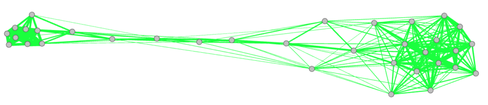
Notice also that, if you prefer, you could remove all the non-significant links from your analysis. Again, you can do it either by removing all the edges in with sig=0 in the Data laboratory page of Gephi. Alternatively, you can repeat the passages from making the network in python, but this time you should set
remove_non_significant=TrueAnd obtain the following network
5.3 Get the position of the nodes
If you still want to play with the nodes and the plots, you can skip this section. However, we are inserting it here because it will be useful for some quick tests in the next sections. Here, indeed, we will find the x and y position of each node.
For doing this we are using the spring_layout function of networkx in python. Furthermore, we are rotating the network using PCA. This will ensure that the main axis will coincide with the x-coordinate (i.e. that the network will be “horizontal” as in all the figures we showed so far).
Therefore, we first import the required packages
import matplotlib.pyplot as plt
from sklearn.decomposition import PCA
And then run the code
pos = nx.spring_layout(G,iterations=5000) # Get the positions with the spring layout

# Restructure the data type
pos2 = [[],[]]
key_list = [] # ordered list of the nodes
for key in pos:
    pos2[0].append(pos[key][0])
    pos2[1].append(pos[key][1])
    key_list.append(key)

# Use PCA to rotate the network in such a way that the x-axis is the main one
pos3 = []
for key in pos:
    pos3.append([pos[key][0],pos[key][1]])

pca = PCA(n_components=2)
pca.fit(pos3)
x_pca = pca.transform(pos3)

# Get the x and y position of each node
xx = x_pca[:,0]
yy = x_pca[:,1]
As result we will have 3 variables:
- xx which is the x-coordinate of each node
- yy which is the y-coordinate of each node
- key_list which is the list of all the nodes in the order they have been used for producing xx and yy
5.4 Heatmap
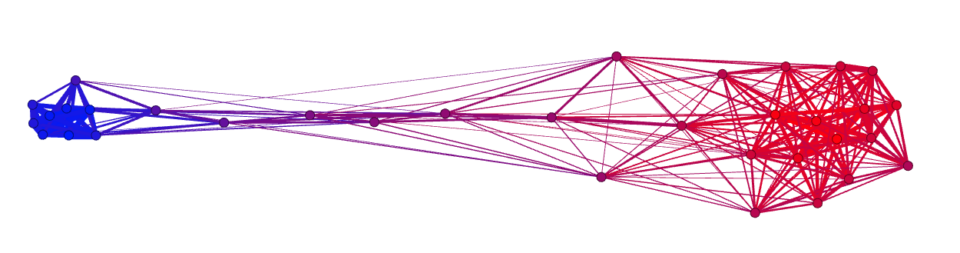
Another type of analysis you can carry on is based on the heat-variables. As previously mentioned, this can be used for multiple types of study. For example, showing that rating of the republicas follows the same axis we observe in the figure, can be used to confirm that the nodes are distributed over a latent variable which corresponds to the left-right spectrum.
Indeed, if we now go to “appearance” and for the “nodes” we select the “ThermoRep_mean” ranking, we observe a pattern like the following one:
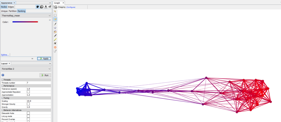
In this case, the cluster of the democrat attitudes is associated (as expected) with a colder feeling towards the republicans. Instead, as we move towards the right, this feeling becomes gradually warmer and warmer. This can be interpreted as the fact that people who hold red attitudes on average feel warmer towards republicans, while people who hold blue attitudes feel colder towards them.
We can run a similar analysis using either the continuous or the discrete (sign) correlation coefficient. Specifically, the discrete one can be useful to identify where the pro-republican area ends and the anti-republican begins.
As mentioned, visually the relationship between position and feeling towards republicans looks extremely clean. But is it really so? Can we confirm it quantitatively?
In the previous section we obtained the x coordinate of each node. So we can simply check if this correlates with the feeling thermometer. To do so, we can use the following code
dict_term = nx.get_node_attributes(G,"ThermoRep_mean") # get the feeling thermo
thermo = [dict_term[key] for key in key_list]
stt.spearmanr(xx,thermo)
Where the first line produces a dictionary of the feeling thermometer values for each node and the second line produces a list with the same order of the nodes in xx. Then we can check the correlation obtaining
SpearmanrResult(correlation=-0.9538579067990832, pvalue=2.7866095518760973e-18)(Note that the correlation can either be positive or negative, depending of the orientation of your network)
Therefore, we confirmed also quantitatively that the relationship between nodes position and feeling thermometer is actually very accurate.
5.5 Analysis of clusters
Another type of analysis that you may want to run involves clusters. Indeed, we intuitively found that that there was a cluster of democrat attitudes on the left and another cluster of republican attitudes on the right. It also looks like the democrat one is much more compact than the republican one. This would mean that the democrats are more “coherent” than the republicans. But how can we be sure of this?
A first way to explore the data with this purpose in mind is to run an algorithm for finding clusters in the network. Since we are already in Gephi, we can use its modularity algorithm, but many other possibilities are possible. To run the algorithm, you should use the panel on the right and click Statistics and then Modularity. Once we run this algorithm, we can visualize the clusters in Appearance->Nodes->Partition->Modularity_class
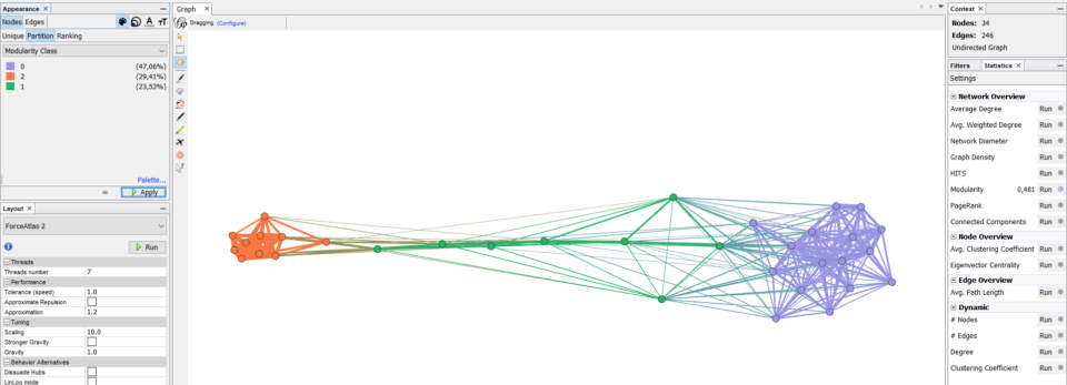
The algorithm found three main clusters, which we can identify as democrat, republican and in-between attitudes. Now, if we want to quantitatively confirm that one is more compact than the other, we can simply measure the average link weight (i.e. correlation) in each cluster.
To do so, we need to firstly select the nodes composing each cluster:
clust1 = ["environment:More_regul++",
"environment:More_regul+",
"abortion:always",
"income:favor",
"immigrants:Allow",
"welfare:increased",
"gay:can_marry",
"gun:More_diffic",
"black:Help++",
"black:Help+"]

clust2 = ["welfare:decreased",
'abortion:spec.Cases',
'income:neither',
'income:oppose',
'immigrants:sendBack',
'immigrants:GuestProgram',
'gay:no_recognition',
'gay:civ.union',
'environment:Less_regul++',
'environment:neut',
'environment:Less_regul',
'environment:Less_regul+',
'gun:Same',
'gun:Easier',
'black:NoHelp++',
'black:NoHelp+',
'black:NoHelp',
'abortion:Never',
'abortion:in_Need']
And define a function that will get the average correlation of a cluster in a given a dummy-coded dataframe (eventually we could have done it also on the network, but doing it on the dataframe will save us some time later)
def get_mean_corr(df_,cl):
    corrs = []
    for i1, el1 in enumerate(cl):
        for i2, el2 in enumerate(cl):
            if i1>i2:
                line1 = df_[el1]
                line2 = df_[el2]
                r = phi(line1,line2, get_p=False)
                corrs.append(r)
    return np.mean(corrs)
Then we can directly run this on the dummy-coded dataframe as:
print("Coherence clust 1: ", get_mean_corr(df_dummy, clust1))
print("Coherence clust 2: ", get_mean_corr(df_dummy, clust2))
Finding the following output
Coherence clust 1:  0.2077054934257627
Coherence clust 2:  0.0707711880591039
This shows us also numerically that the first cluster is more compact (or coherent or correlated) than the second, confirming numerically what we observed in the graph. However, can we really trust these numbers?
5.6 Bootstrapping
When producing numerical outputs we may want to make sure that they are not actually due to random variation of the data. For measuring this type of stability, we can use bootstrapping. This roughly consists in randomly resampling the original dataset and observing how our output changes. For example, in the previous section we found that the first cluster had stronger correlation than the second; will this still be the case after resampling?
We can randomly resample the dataset by firstly generating a string of random numbers (i.e. randomly chosen participants) and then passing it as input to the dataframe
index_t = (np.random.rand(df_len)*(df_len-1)).astype(int) # generate the list
df_t = df_dummy.iloc[index_t] # resampled dataframe
Then, each time, we would calculate the mean correlation for each cluster. Notice that this, eventually, would mean that we have to re-calculate the network each time. But since the mean correlation can be obtained directly from the initial dataframe, we can skip this step saving a little of time.
Thus, we write the code that runs N_rep times, each time producing a new dataframe from the original one and then calculating the mean correlation of the two clusters.
N_rep = 100

M1 = []
M2 = []

df_len = len(df_dummy)

for i in range(N_rep):

    index_t = (np.random.rand(df_len)*(df_len-1)).astype(int) # generate the list

    df_t = df_dummy.iloc[index_t]

    m1 = get_mean_corr(df_t, clust1)
    m2 = get_mean_corr(df_t, clust2)

    M1.append(m1)
    M2.append(m2)
M1 and M2 are two lists which contains the mean correlation of the respective clusters. e.g. the fifth entry of M1 is the average correlation of cluster 1 during the fifth resampling.
Now, we can show the results in different ways. One is to show the 10-90% interval for each cluster
print("Clust1: ", np.round(np.percentile(M1,10),3), "-", np.round(np.percentile(M1,90),3))
print("Clust2: ", np.round(np.percentile(M2,10),3), "-", np.round(np.percentile(M2,90),3))
Resulting in:
Clust1:  0.203 - 0.211
Clust2:  0.069 - 0.072
From this is possible to see that the top 90% of cluster 2 is still smaller than the smallest 10% of cluster 1.
Alternatively we can also perform it as a test to see how often in the bootstrapped data our hypothesis is verified. i.e. How many times the average correlation in cluster 1 is bigger than the value in cluster 2.
tests = np.array(M1)>np.array(M2)
np.sum(tests)/len(tests)
By running this cell, we obtain 1.0, telling us that in 100% of the cases of bootstrapping our hypotesys is verified. Similarly, you can invert the relationship as to produce a p-value like result, where the smallest the better. Indeed, this will tell us that our hypothesis is falsified 0% of the times:
tests = np.array(M1)<=np.array(M2)
np.sum(tests)/len(tests)
5.7 Congratulations
… and this is it! Congratulations for finishing this tutorial.
If you have any questions or you found some issues in the code, feel free to send us an email.