In this page, we will explain in an intuitive and informal way how ResIN works and how you can interpret its outputs. If you are looking for a more formal and complete description, check out the advanced concepts page. However, we suggest you start here to have a general understanding of what ResIN is and what is the rationale behind it.
The idea behind ResIN
Many of us can already have an intuitive idea of closeness between attitudes. For example, the attitude Support gay rights should be relatively close to (or related to) Support gun control and far from Support gun rights, at least in the context of American politics. But how can we recognize this? And what it actually means?
In the specific case of this example, is because the American political landscape is mostly divided into two political groups: Democrats (supporting gay rights and gun control) and Republicans (supporting gun rights and “traditional family values”).
This example is insightful because it shows what can give to some people the idea that two attitudes are related or close together. Indeed, as humans, we can perceive the fact that “people who hold attitude A usually hold attitude B.” This is what can give us the idea that attitudes A and B are related or “close together.”
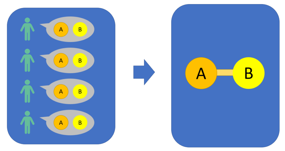
This is actually what ResIN looks for. If in a dataset people who hold A tend to also hold B (and vice versa) ResIN will produce a connection between these two attitudes. Furthermore, this connection will be “stronger” the more related the two attitudes in the analyzed population.
For example, if 100% of the people holding A also hold B (and vice versa), ResIN will produce the strongest connection between these two. As this percentage goes down, also the strength of the connection will decrease accordingly.
All these connections and strengths have a natural formalization in network theory. Using this approach, we think of each attitude as a node (i.e. visually as a circle or dot) and the connection between these nodes as a link (i.e. the line connecting them). These links have “weights” which represent the strength of the connection. Visually, the bigger the weight, the thicker the link.
Closeness, clusters and latent space
Closeness
If you look at the following figure, you will see two visualizations of the same network. Indeed, both the nodes and the weighted links are the same. However, the one on the right is someway better than the one on the left. Why is that so?
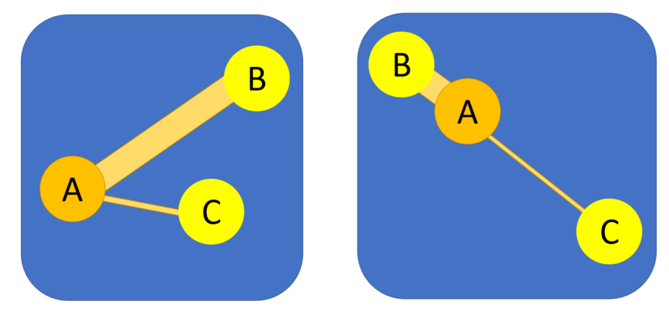
The visualization on the right tries to organize nodes matching spatial position with proximity. This means that if two nodes have a strong connection, they will also appear close together, while if they are weakly connected, they will appear much further apart. The visualization on the left, instead, just places nodes in a random position and lets us know the strength of connection only using the thickness of the edge.
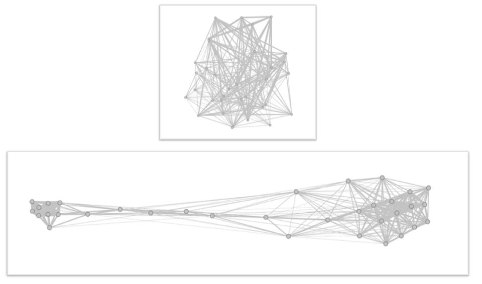
You may think that this process is redundant. After all, we already have the thickness information, why would we need to repeat the same information spatially? The main reason become visible when we start having many more nodes. For example, below we see a network with 34 nodes. The two visualizations contain the same underlying information about the network structure. However, the random one requires us to manually explore any connection (which eventually will be ~500 possible links), while the other one already places together connected nodes. This is quite similar to the idea we mentioned before that strongly connected attitudes are someway “close to each other.” Indeed, this method is able to encode this connection as a spatial closeness.
But how does this method work?
These methods are called force-directed algorithms and they are mostly used for visualizing networks, even if in ResIN they can also produce a latent space (but more on this later). The main idea behind these algorithms is to imagine nodes repelling each other as if they were electrically charged particles. At the same time, the links act as springs pulling nodes together. Specifically, the bigger the weight of the link (i.e. the strength of the connection) the stronger the attractive force of the spring.
This result in the fact that nodes which are strongly connected will be placed very close together, as they are connected by “a very strong spring.” Instead, nodes which have weak connections will appear much further apart.
What about the clusters?
Let us stop discussing nodes for a moment and let us come back to the actual attitudes. We can imagine for a moment to have a survey with three political questions. Each question has 3 possible answers: one which will be mostly selected by republicans, one by democrats and one by neutrals. For example:
The government should do everything to support gay rights.
[] Agree [] Neutral [] Disagree
(where the Agree will be the Democrat attitude, the Disagree, the Republican attitude, etc.)
If we now use resin on this (fictitious) dataset we will obtain something like the following figure. Why?
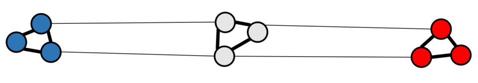
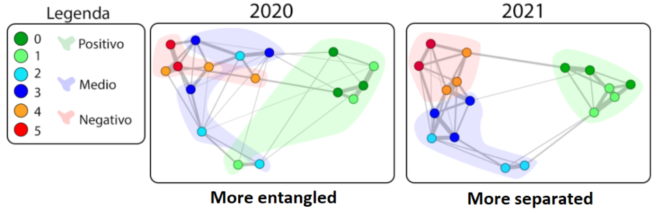
First of all, we will see the appearance of the clusters (i.e. the three groups). This is due to the fact that people selecting one of the democrat attitudes will be also very likely to select also the other democrat attitudes. As we discussed before, this means that we will have strong links between the democrat attitudes and this will also result in them being close to each other in the visualization.
At the same time, people are clones of each other. Meaning that we will have some variations and that, for example, there will be some individuals which hold some neutral and some democrat attitudes. This will produce some links between the neutral and the democrat attitudes. However, this link will be much weaker that the previously mentioned one, thus making these cluster appear well separated to each other.
Finally, we could also have some people holding both some democrat and some republican attitudes. However, this behavior will be very rare and, instead, the main one will be that people selecting democrat attitude will not select the republican ones (and vice versa). Becuase of this, the two clusters will not be connected and appear as far as possible.
Latent space
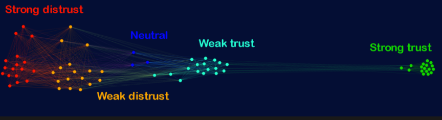
The last figure we observed is intriguing, as it someway reproduces the left-right spectrum (notice that this is done on fictitious data, but the same structure appears also with simulations and real survey data). This suggests someway that the space we are observing in the visualization is not just reading the network more easily, but is also reproducing some latent variables (or factors, if you prefer).
As we will discuss more in detail in the advanced concepts (or directly in this article) the spatial dimension in ResIN is actually a latent variable. Therefore, if we use ResIN with monodimensional political data (i.e. that can be reduced to a single factor) we will observe data reproducing the left-right political spectrum.
We want to point out again that this happens because the democrats are connected to the neutrals and the neutrals to the republicans. This chain of connections is what actually restores the ordinality of the data.
Only a nice visual?
So far we discussed almost exclusively about the visual component. This may push some people to think that ResIN is a visualization method and that can be used only for qualitative analysis. However, this is not true. Indeed, ResIN is not a visualization method, even if the visualization of its output can be extremely informative.
Indeed, ResIN produces a spatial network (i.e. a network with latent space properties). This is a mathematical structure with quantitative properties. Furthermore, these properties can be explored using tools developed both for latent space and for network analysis. But if this is the case, then why we spent so much time about the visualization?
ResIN is developed for studying and exploring attitudes as a system. This requires flexibility and not “forcing” the attitudes into some pre-determined structures. However, this also means that we have very limited knowledge of the type of patterns (i.e. the type of system) that can emerge from the data.
Because of this, it is convenient to first analyze data in a qualitative way using the visualization. This is often enough for identifying important features of the system (e.g. the presence of clusters). However, this step is still qualitative and should not be considered conclusive.
Indeed, it is convenient in a second step to quantitatively explore ResIN’s output to confirm the features that we initially oberved. This will give you the answer to some questions as: Is a specific cluster more compact than the others? Do some attitudes actually belong to a specific cluster? Are these results statistically significant?
So the general approach with resin is:
- Qualitatively explore the visualization to quickly find interesting patterns
- Confirm them (if they really exist) using a quantitative analysis
Reliability measures
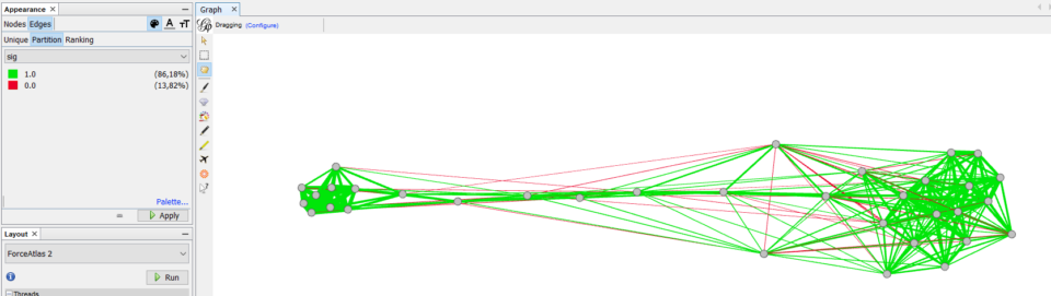
We will not discuss this here, but take into account that the reliability of ResIN has been tested comparing results with other methods (such as item-response theory). Furthermore, the method itself contains some measurements for checking the reliability of the results. For example, in the tutorial we show how to directly observe the significance of the links between the nodes (as in the figure below).
What can I use ResIN for?
Resin has been designed for studying attitudes in a more holistic way. Because of this, it does not impose a fixed structure on the data, leaving more room for exploration. This also means that Resin can be employed to study multiple phenomena and environment also outside attitude systems. Some examples include:
1. Study of vaccination-related attitudes. In this study, we found that the more the pro-vaccine attitudes are isolated (i.e. separated from the rest of the attitude system) the less the pro-vaxxers can influence the neutrals. This resulted also in a consequent increase in distrust and lower vaccination coverage.
2. Study how different dimensions in a psychological test become more aligned during the Covid pandemic.
3. Analysis of Twitter data and recognizing which tweets are “ideologically close”
What to check next?
If you feel ready, you can explore the advanced concepts or, if you prefer to directly play with the method, you can start the tutorial.